

Table of contents
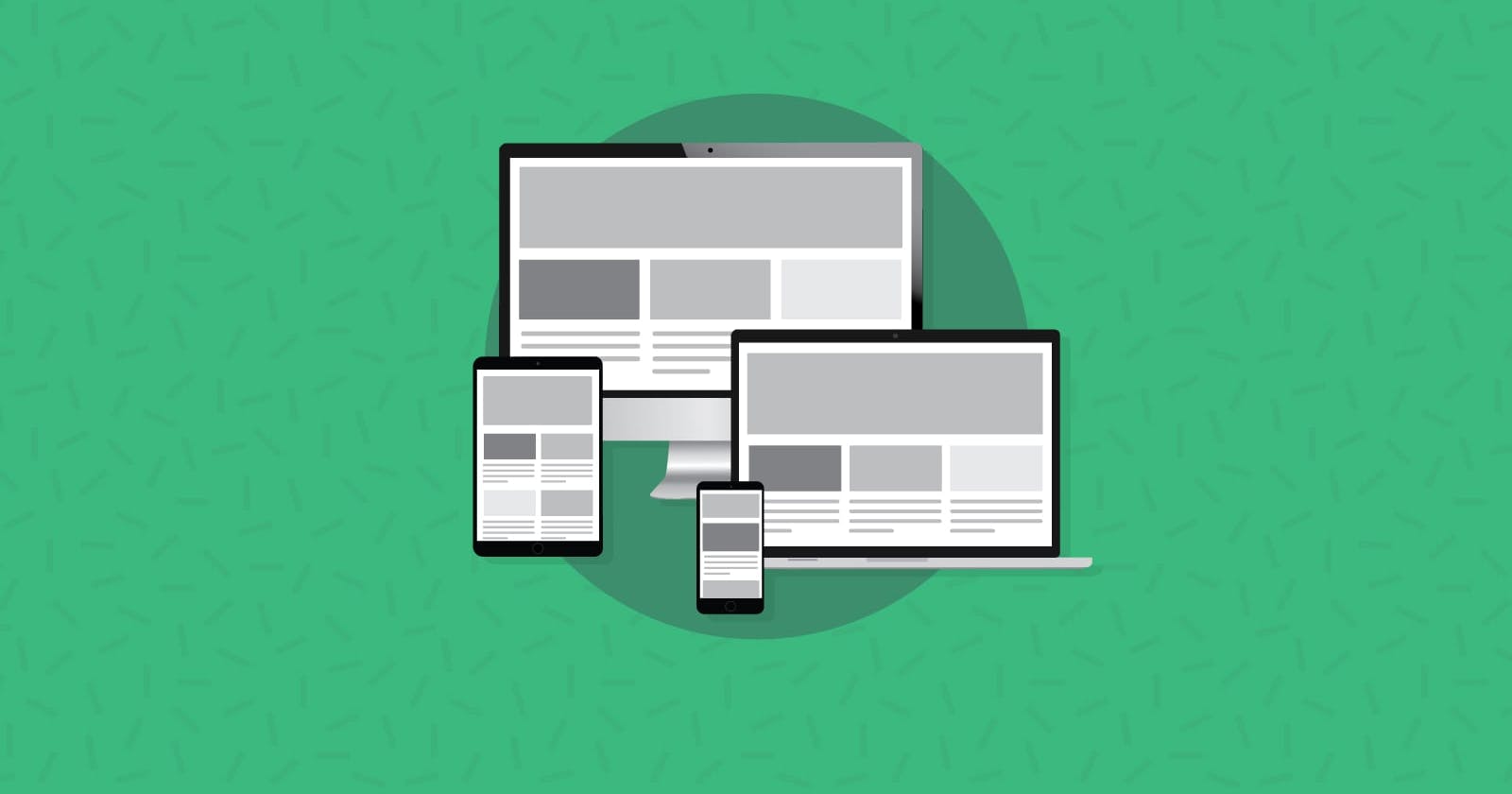
CSS Media Queries allow you to create responsive websites across all screen sizes, ranging from desktop to mobile. So you can see why it's important to learn this topic.
SYNTAX
@media screen and (max-width: 768px){
  .container{
   //Your code's here
  }
}
Media Types
all
print
screen
speech
Breakpoints
Mobile -> 576px
Tablet -> 768px
Laptop -> 992px
Desktop -> 1200px
$mobile  : 576px;
$tablet  : 768px;
$laptop  : 992px;
$desktop : 1200px;
min-width & max-width Functions
max-width function
Using this function, we are creating a boundary. This will work as long as we are inside the boundary.
min-width function
We are also creating a boundary here. But this will work if we go outside the boundary.
@media screen and (max-width : 576px){
  .container{
    background-color: #c3c3c3;
  }
}
HAPPY LEARNING :)