Flex Box


The Flexbox model allows us to layout the content of our website. Not only that, it helps us create the structures needed for creating responsive websites for multiple devices.
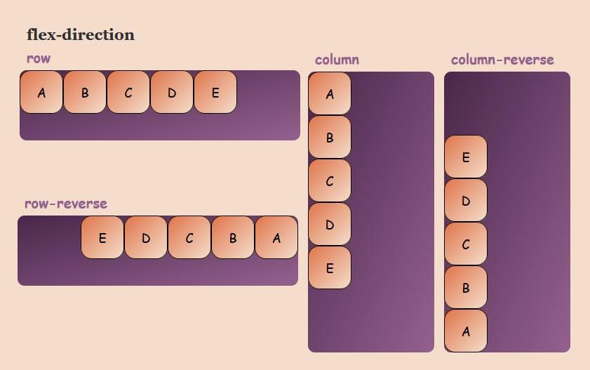
flex-direction property
This property allows us to set the direction and orientation in which our flex-items should be distributed inside the flex-container.
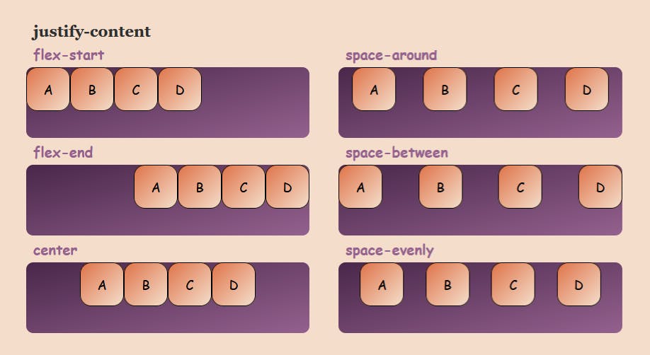
justify-content property
This property arranges flex-items along the MAIN AXIS inside the flex-container.
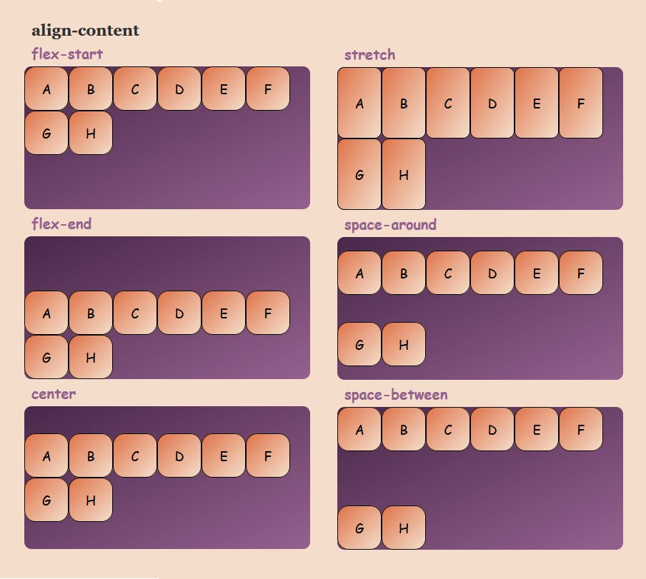
align-content property
This property arranges flex-items along the CROSS AXIS inside the flex-container. This is similar to justify-content.
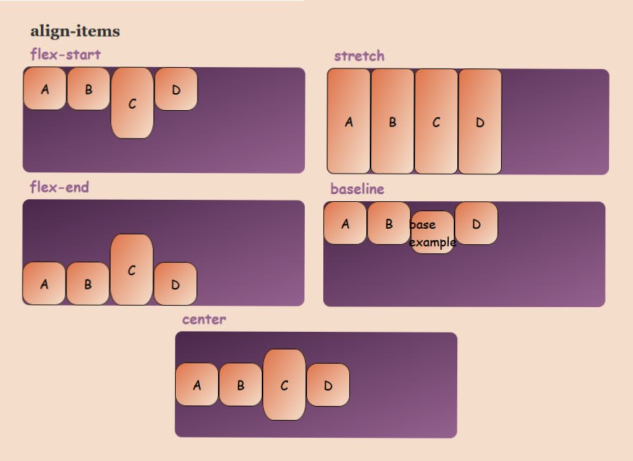
align-items property
This property distributes Flex-items along the Cross Axis.
align-self property
This property works on the child classes. It positions the selected item along the Cross Axis.

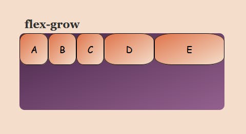
flex - grow
This property grows the size of a flex-item based on the width of the flex-container.
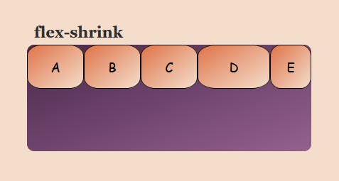
flex-shrink
This property helps a flex item shrink based on the width of the flex-container. It's the opposite of flex-grow.
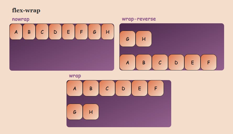
flex-wrap
This property helps you set the number of flex-items you want in a line or row.
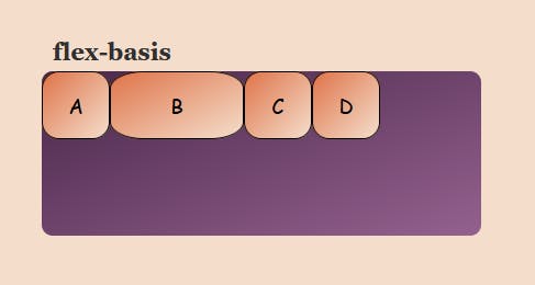
flex-basis
This is similar to adding width to a flex-item, but only more flexible. flex-basis: 10em, for example, will set the initial size of a flex-item to 10em. Its final size will be based on the available space, flex-grow, and flex-shrink.
HAPPY LEARNING :)