

A grid can be defined as an intersecting set of vertical and horizontal lines. CSS Grid layout separates a page into major sections. Grid property offers a grid-based layout system having rows and columns. It makes the designing of web pages easy without positioning and floating. The grid layout gives us a way to create grid structures depicted in CSS, not in HTML.
display
The display property sets whether an element is treated as a block or inline element and the layout used for its children, such as flow layout, grid, or flex.
display: grid;
grid-template-columns
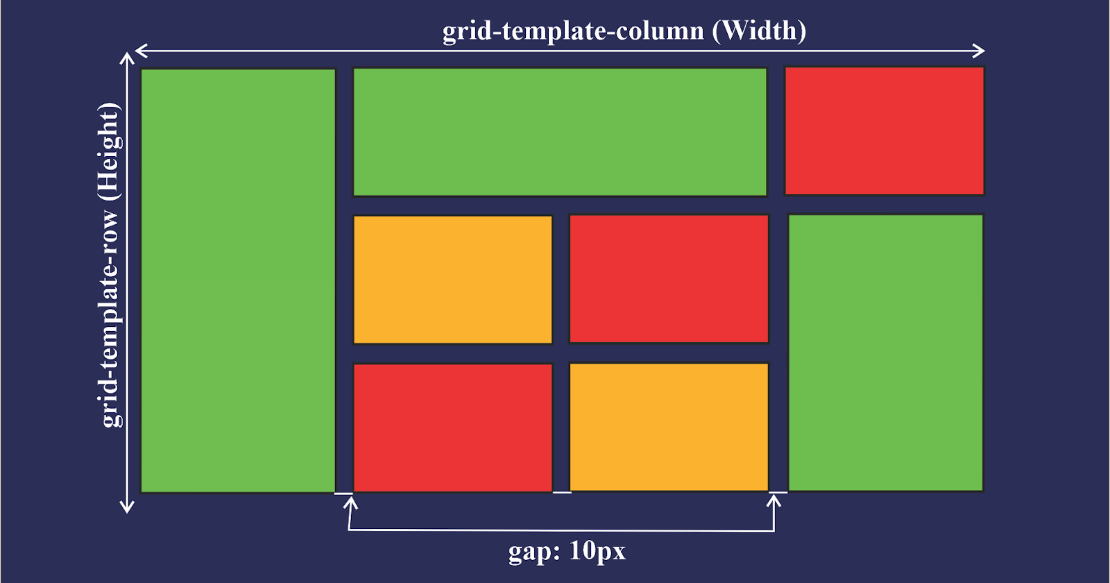
The grid-template-columns property defines the line names and track sizing function of the grid columns.
grid-template-columns: none;
grid-template-columns: 100px 1fr;
grid-template-columns: minmax(100px, 1fr);
grid-template-columns: subgrid;
grid-template-columns: masonry;
grid-template-columns: inherit;
grid-template-columns: initial;
grid-template-columns: revert;
grid-template-columns: revert-layer;
grid-template-columns: unset;
grid-template-rows
The grid-template-rows property defines the line names and track sizing function of the grid rows.
grid-template-rows: none;
grid-template-rows: 100px 1fr;
grid-template-rows: minmax(100px, 1fr);
grid-template-rows: subgrid;
grid-template-rows: masonry;
grid-template-rows: inherit;
grid-template-rows: initial;
grid-template-rows: revert;
grid-template-rows: revert-layer;
grid-template-rows: unset;
grid-template-areas
The grid-template-areas property specifies named grid areas, establishing the cells in the grid and assigning the cells in the grid, and assigning them names.
grid-template-areas: "a b";
grid-template-areas:
  "a b b"
  "a c d";
grid-template-areas: none;
grid-template
The grid-template property is a shorthand property for defining grid columns, grid rows, and grid areas.
grid-template: none;
grid-template: 100px 1fr / 50px 1fr;
grid-template:
  "a a a"
  "b b b";
grid-auto-columns
The grid-auto-columns property specifies the size of an implicitly created grid column track or pattern of tracks.
grid-auto-columns: 200px;
grid-auto-columns: 0.7fr;
grid-auto-columns: min-content;
grid-auto-columns: max-content;
grid-auto-columns: auto;
grid-auto-columns: fit-content(200px);
grid-auto-columns: 100px 200px 300px;
grid-auto-rows
The grid-auto-rows property specifies the size of an implicitly created grid row track or pattern of tracks.
grid-auto-rows: 200px;
grid-auto-rows: 0.7fr;
grid-auto-rows: min-content;
grid-auto-rows: max-content;
grid-auto-rows: auto;
grid-auto-rows: fit-content(200px);
grid-auto-rows: 100px 200px 300px;
grid-row-start
The grid-row-start property specifies a grid item's start position within the grid row by contributing a line, a span, or nothing to its grid placement, thereby specifying the inline-start edge of its grid area.
grid-row-start: auto;
grid-row-start: 3;
grid-row-start: span 2;
grid-row-start: somegridarea 3;
grid-row-start: 4 somegridarea span;
grid-column-start
The grid-column-start property specifies a grid item's start position within the grid column by contributing a line, a span, or nothing to its grid placement. This start position defines the block-start edge of the grid area.
grid-column-start: auto;
grid-column-start: 3;
grid-column-start: span 2;
grid-column-start: somegridarea 3;
grid-column-start: 4 somegridarea span;
grid-row-end
The grid-row-end property specifies a grid item's end position within the grid row by contributing a line, a span, or nothing to its grid placement, thereby specifying the inline-end edge of its grid area.
grid-row-end: auto;
grid-row-end: 3;
grid-row-end: span 2;
grid-row-end: somegridarea 3;
grid-row-end: 4 somegridarea span;
grid-column-end
The grid-column-end property specifies a grid item's end position within the grid column by contributing a line, a span, or nothing to its grid placement, thereby specifying the block-end edge of its grid area.
grid-column-end: auto;
grid-column-end: 3;
grid-column-end: span 2;
grid-column-end: somegridarea 3;
grid-column-end: 4 somegridarea span;
grid-row
The grid-row is a shorthand property that specifies a grid item's size and location within a grid row by contributing a line, a span, or nothing to its grid placement, thereby specifying the inline-start and inline-end edge of its grid area.
grid-row: auto;
grid-row: somegridarea;
grid-row: somegridarea / someothergridarea;
grid-row: somegridarea 4;
grid-row: 4 somegridarea / 6;
grid-row: span 3;
grid-row: 5 somegridarea span / 2 span;
grid-column
The grid-column CSS shorthand property specifies a grid item's size and location within a grid column by contributing a line, a span, or nothing to its grid placement, thereby specifying the inline-start and inline-end edge of its grid area.
grid-column: auto;
grid-column: somegridarea;
grid-column: somegridarea / someothergridarea;
grid-column: somegridarea 4;
grid-column: 4 somegridarea / 6;
grid-column: span 3;
grid-column: 5 somegridarea span / 2 span;
grid-area
The grid-area shorthand property specifies a grid item's size and location within a grid by contributing a line, a span, or nothing to its grid placement, thereby specifying the edges of its grid area.
grid-area: auto;
grid-area: some-grid-area;
grid-area: some-grid-area / another-grid-area;
grid-area: 4 some-grid-area;
grid-area: span 3;
grid-area: 2 span / another-grid-area span;
row-gap
The row-gap property sets the size of the gap between an element's rows.
row-gap: 64px;
column-gap
The column-gap property sets the size of the gap between an element's columns.
column-gap: 2px;
gap
The gap property sets the gaps between rows and columns. It is a shorthand for row-gap and column-gap.
gap: 20px;
gap: 20px 10px;
HAPPY LEARNING :)